Over the past week I have taken photographs of models that I would like to use for my music magazine front cover, contents page and double page spread article.
This is a screen shot of the thumb nails for the photographs I have taken.

Chosen Images for Front cover, Contents and Double page spread.

This is the image I have chosen to use for my double page spread article as I feel this is the best photo to use as it shows the model/artist for my music magazine holding the guitar with a cheerful expression on his face, this is a convention of pop magazines as my model/artist looks happy, which represents a happy artist who enjoys what they do.

This is the image I have chosen to use for my contents page, as this is the same artist in different clothing, he looks happy and has a different pose.

This is the image I have chosen to use for my front cover as it shows a cheerful artist, this follows conventions of a pop magazine. I have also chosen this image as it is a mid-shot which is also a convention of pop magazine front covers.
Computer Roughs.
Front Cover Layout


Double Page Spread Layout

These are the layout designs for my music magazine. The green shows where I will place my Headings, Cover lines, Text and Quotations. The colour blue shows where the images will be placed on the page and the purple is the conventions for example the pug on the front cover.
Double page spread article
For this task I had to write a 1500 word article for my double page spread.
Clink the LINK to view my article.
Photography Introduction.
On Tuesday I went to a photography session in which I learnt all about what makes a better shot, what the best cameras are to use and what it takes to book the college studio to use for my photo shoot.
At the start of the session I learnt all about how to book the college studio, in order to do this I need to go to the art office and book a date and a time to use the studio with a technician in advance prior to the photo shoot. After this I will then need to let my teacher know about when the photo shoot is. On the day I will need to go to the art office and ask a technician to unlock the studio, I will then need to once completed my photo shot for my magazine ask the technician to check the room over and then it will be allowed to be locked.
In regards to taking the photos for my music magazine I will need to plan my shoot thoroughly and have a very good idea of who I want to be my model, what costume, props and makeup that I want my model to wear/use, I will also need to organise the set up where the photos will be taken. In the introduction session I learnt that the image will be better to crop on a white background. I also learnt the do's and dont's of photography.
When taking my photos I need to make sure that I don't have any random poses, that are not related to my magazine cover, contents page and double page spread. I need to make sure that if I am cropping in a background that the photo needs to be taken, against a white background as this is easiest to crop and finally don't place your main image in the magazine article double page spread in the middle of the two pages as this looks unprofessional and doesn't look very good as the image is then not clear.
In order to have very good and professional looking photos, I need to take high quality pictures, using an SLR camera, I also need to have planned my photos well, maybe using mood boards to help with my planning, to experiment with depth of field as this makes the photos textured and adds depth. Have appropriate Representations, pose, costume, props, hair and makeup.
In the introduction to photography I also learnt that it is very important to consider these points when taking photos professionally: lighting, What is in the frame shot (background, clothing, pose , props) , Models - use a person that is not camera shy and will be willing to be in your photographs, they also need to be willing to pose confidently in front of the camera, shot positions (long, mid or close) Although I leanrt these important things I also learnt that the quality of the photo is important and that it is no point having all of these things perfect and to a good standard and then have a poor photo quality.
And finally for my blog I will need to keep all photos taken so that I can choose the best photos for my magazine cover, contents page and double page spread article.
This is the Prezi for my Music Magazine Pitch.
Third Hand Drawn Drafts
Here are my third hand drawn drafts of my hand drawn drafts for my Pop music magazine.
This is the front cover page for my 3rd hand drawn draft.
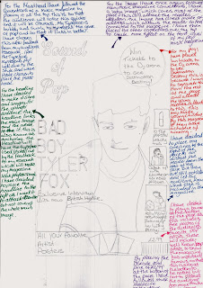

This is the Double page spread magazine article 3rd hand drawn draft.

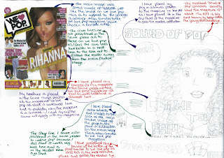
Here are my second hand drawn drafts of my Initial plan for my Pop music magazine.
This is the front cover page for my 2nd hand drawn draft.

This is the Contents page for my 2nd hand draw draft.

This is the Double page spread magazine article 2nd hand drawn draft.

These are the typeface results from my target audience on the masthead.

The most popular typeface (located below) had the most tally's with a number of six. This is because I feel the audience thinks that this typeface is more appealing to the specific target audience, will give the magazine a unique identity and house style plus the type face is also quite swirly therefore appealing to a young female target audience. Personally I feel that this type face will work very well as my pop music magazine masthead.
These are the typeface results for the headline of my pop music magazine.

The most popular typeface (located below) had the most tally's with a number of four. This is because I feel the audience thinks that this typeface is more appealing to the specific target audience, will give the magazine a unique identity and house style plus the type face is also bold therefore grabbing he readers attention and potentially drawing them into the magazine. Personally I feel that this type face will work very well as my pop music magazine headline as it looks neat and gives the magazine a professional finish overall.
These are the typeface results for the article text on my double page spread.

The most popular typeface (located below) had the most tally's with a number of five. This is because the audience think that this typeface is more appealing to the specific target audience, will be easy to read for young readers, the typeface is also simple yet effective. Personally I feel that this type face will work very well as my pop music magazines double page spread article.
Magazine name ideas.
To come up with a suitable name for my magazine I created a mind map to brain storm some ideas I had.

After a long think about the name for my music magazine, I decided to use 'Sound of Pop' as the name for my magazine. This is because it clearly states what genre the magazine is on for the younger audience, it targets my audience well because of the type of music the name is associated with and the name also sticks in the mind and is short and snappy.
upon deciding on a name for my pop magazine, I then needed to decide on a typeface for the masthead, Headline and Article text. This needs to be something that stands out to readers and that they will recognise easily. It also needs to represent the genre of the music in the magazine and appeal to the specific target audience. To get some ideas on a typeface design I used the website 'dafont.'
Typeface ideas.
These are the typefaces I am considering to use for the Mast head, for my Music Magazine. I will be creating a table and then I will ask the target audience to tally which typeface they prefer for my specific genre.

These are the typefaces I am considering to use for the Headline, for my Music Magazine. I will be creating a table and then I will ask the target audience which typeface they prefer for my specific genre of magazine.

These are the typefaces I am considering to use for the main text in my article, in my Music Magazine. I will be creating a table and then I will ask the target audience which typeface they prefer for my specific genre of music magazine.

Initial Plan For My Music Magazine.
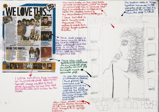
For my initial first hand drawn drafts I have compared them to 'We Love Pop' as this is a teen pop magazine for girls, I thought that this would be a very good and suitable magazine to relate and compare to my music magazine as I aim aiming my magazine at the same target audience, I have done this as it will help me to develop and improve me designs and ideas for my own music magazine.
By comparing my own music magazine designs to 'We Love Pop' helps me to develop my own ideas and to make my music magazine different to the magazine I have chosen to compare mine to I can find gaps in the market with that specific target audience that the publishers of 'We Love Pop' have missed or not included.
This is my front cover initial plan design.
This is my contents page initial plan design.
This is my double page spread article initial plan design.

No comments:
Post a Comment