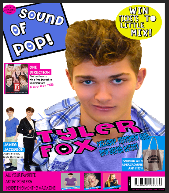
This is the final version of my music magazine Front Cover
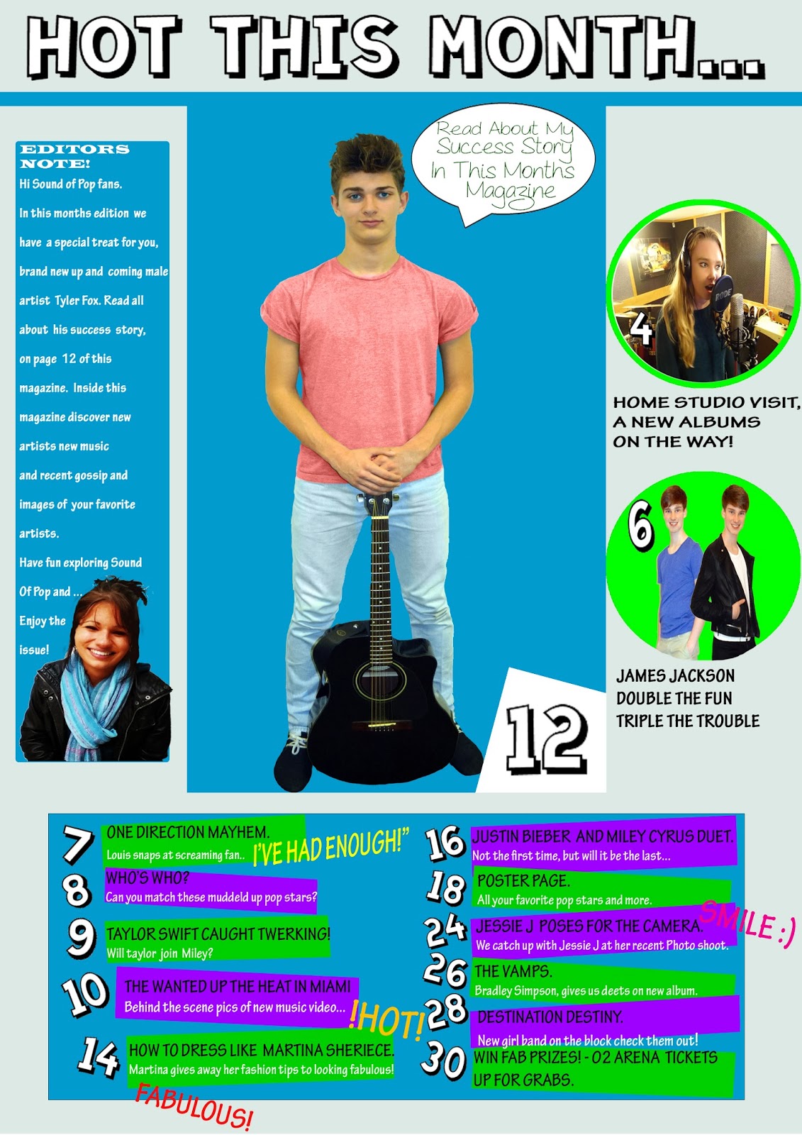
This is the final version of my music magazine Contents Page
This is the final version of my music magazine Double Page Spread Article


Construction
To start off my double page spread article I begun to crop out the background of my model to make the picture look more professional as the background to my photograph is not ideal for my magazine.
To start off my double page spread article I begun to crop out the background of my model to make the picture look more professional as the background to my photograph is not ideal for my magazine.

In the next image I have adjusted the contrast of the image and the colour of his skin, to make the photograph look more professional.

In the image below I have airbrushed the models face, to eliminate spots and make his skin look flawless, as this also make the photograph look more professional.

In the screen shot below I have begun to add the headline for my article 'Bad Boy Tyler Fox' I have then added a background colour to test.

In this screen shot I have changed the colour of the headline for the article as I felt it needed some colour, but then decided it does not look as professional as it did in black and white, I have also erased the background colour as I felt it needed an image instead of a block colour which I will be adding later in my development.

In this screen shot I have slowly begun to add text to my article page on the left. I have also begun to play around wit colours and highlight the interviewers questions in this.


In this screen shot I have begun to add the fact file to my article about the artist.

In this shot I have added a background block to the fact file to see which layout I prefer.

TARGET AUDIENCE & TEACHER FEEDBACK FOR ARTICLE DRAFT
Below in the green writing is the feed back I have received from my teacher, explaining what I need to do to improve my pop music magazine.


The next three feed back forms are from the target audience of my magazine explaining what they think I need to improve, to make my magazine more professional and pop like.


Construction Continued...
In this screen shot I have added the relationship secrets about Tyler Fox, I have also added a heart behind the text as this was suggested to me in the feedback I carried out to make the article look more pop orientated.

In the screenshot below I have begun to crop out the background from the image (that I am going to use on my contents page) I have taken of the model below, I have chosen a different shot type here to make sure that I have a range of different shot types throughout my magazine, to make it conventional.

In this screen shot I have added the heading of what the page is about...

In this screen shot I have added a black background which I am going to place behind the main image on this page as I feel that it will give the page a better layout structure.

Here I have added the final crop out of the model and placed the image over the background, I have noticed here that the models guitar and shoes blend into the black background, I need to change this to make sure that the image stands out more, this will also make the magazine more professional and help the magazine look more 'poppy'.

Here I have added another image on the right of the main image this is because many pop magazine's have many images on the contents page, to relate to pages throughout the magazine. This is a convention of many pop magazines.

Here I have decided to change the layout slightly and added text below the image on the left. I have also added a box in the bottom right of the main image to become a background for the page number which I have also added.

In this screen shot I have added more images to the left which I am going to link to specific pages throughout the magazine. I have also played around with the colours that I would like the background to be for my contents page, I would like the colours to be bright and colourful to attract the readers eye.
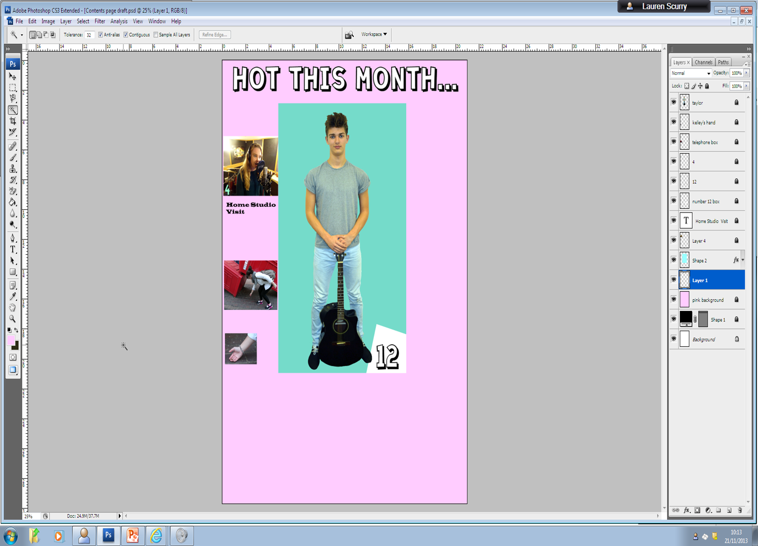
In this shot I have changed the background colour to pink, this make the magazine more pop orientated and girly. I have also added a line underneath the title of the page to add definition to the page and help to make the contents page look more professional. I have also added a highlight ring to the bottom image on the left of the page to make the reader wonder why the hand of that model is highlighted, this ring also matches the colour of the background to the main image.

Here I have added an extra pink box below the main image this is because I wanted to have a back ground to the text I am going to add later. I have also added a piece of text beneath the images to the left to help the reader understand what is on the page specified.

Here I have added all of the text below the main image in the highlighted text box to let the reader know what is on each specific page. Later I am going to add numbers to this.

TARGET AUDIENCE FEEDBACK FOR CONTENTS DRAFT
The next two feed back forms are from the target audience of my magazine explaining what they think I need to improve, to make my magazine more professional and pop like.


I will be taking on-board all of this feedback from my teacher and my target audience I will then make changes to my article accordingly.
Construction Continued...
In this screen shot I have added the number '7' to the first line of text in the text for each page. I have decided that to make my page more interesting that I am going to make the numbers very visible to the audience and I am also going to tilt them slightly to make the page less in order but to have structure about it, I am also going to highlight each page of text with a colour, to also make it stand out, I may also tilt these slightly at a later date once I have done this for each page.

In this image I have cropped out the background from the photograph I am now going to begin constructing the front cover for my music magazine.

In this image my model has some blemishes which I am going to blend and remove, I am also going to lighten the image to bring out the colours more.


In this image I have removed the blemishes on the model and increased the brightness of the image, I have also softened the contrast and increased the sharpness of the image so that the outline is more dominant and clean.

In this image I have added the mast head to my front cover page.

In this image I begun to add a pug and banner to make my music magazine more conventional, I have also added the background which I am not too sure yet that I like.

In this screen shot I have added text to my pug banner and I have also added a barcode and price in the bottom right hand corner.

In this screen shot I have decided to get rid of the background and I have added a tilted background box to my mast head as I feel it helps it to stand out more and also gives the page more colour. In this shot I have also added an extra image I will continue to do this to make my front cover more interesting, I will also be adding captions to these to help the audience to understand.

In this screen shot I have begun to add the cover lines to my cover. I have also added blank boxes on my banner where images will eventually go, once I have taken them.

TARGET AUDIENCE FEEDBACK FOR FRONT COVER DRAFT
The next two feed back forms are from the target audience of my magazine explaining what they think I need to improve, to make my magazine more professional and pop like.


I will be taking on-board all of this feedback from my teacher and my target audience I will then make changes to my article accordingly.
Construction Continued...


Draft Feedback from Teacher.
Below is the feedback for my front cover draft, Which I have received back from my teacher. There are several improvements that I need to make to this in order for my music magazine to be professional .
The improvement are as follows:
- To smooth the edges of the artists hair line
- Make my mast head smaller
- Remove the white edges on the masthead words
- To un-stretch the headline of the magazine.
- Rethink the head line as in the article my artist doesn't come across as a 'Bad Boy'
- Don't use the image with the phone box
- Don't use black on the cover page for the boxes.
- Crop the image more so that his face is more prominent on the front cover of the magazine.
- Use capitals in the banner
- Fill in the posters in the banner
- Add the date to the barcode and make the price smaller.

Below is the feedback for my contents page draft, Which I have received back from my teacher. There are several improvements that I need to make to this in order for my music magazine to be professional .
The improvements are as follows:
- Use captions around the main image for pg.12
- Don't use the image of Kelly and the penny
- Re-crop the main image as the cropping is unprofessional.
- Fill in the empty space on the right hand side of the page.
- Subheadings needed for the features on each page
- Make the language on the page more exciting
- My magazine about 60 pages long.

Below is the feedback for my article draft, Which I have received back from my teacher. There are several improvements that I need to make to this in order for my music magazine to be professional .
The improvements are as follows:
- More engaging headline needed
- Erase the speech bubbles they are not needed
- Don't have gaps between Q's and A's
- Give a clue about album, to 'feed' the fans
- End the interview
- Change the colour scheme it doesn't work
- What did eh sing and why?
- Page numbers?
- Place fact file and relationship secrets in bubbles (colourful)
- Poor cropping of head of artist.
- Flip the image so that the guitar intergrades with the text.

These are the improvements I am making to my magazine drafts from the feedback which I have received from my teacher.
In the image below I have begun to change around the layout of my article as I feel that the layout of my article before did not work very well. This was there is an even amount of colour on each page or the double page spread.


In the image below I have straightened and aligned all of the text on the double page spread this makes the text layout look professional and neat.

In the image below I have added the image of the artist to the double page spread article, I have followed the feedback from my teacher and have transformed the image so that it spreads across both pages of the double page spread.

In this image I have added page numbers to my double page spread article. This is not my final construction yet, I still have some minor improvements to make to this.

This is the contents page being improved from the feedback I have received from my teacher. In the image below I have added captions and a speech bubble from the artist, on the page to make it seem busy and that there is a lot going on as this is a convention of a pop magazine.

In the image below I have added more images and numbers to make the page more colourful and appealing to a younger audience. I have used the colour green as this makes the images of the artists stand out to the audience more. This is not my final construction yet, I still have some minor improvements to make to this.

Below are the images of the changes I have made to my front cover, according to the teacher feedback I received. In this image I have changed the colour to the pug, mast head, banner, headline and strapline as I feel that these colours work better on the page as they make the cover brighter. I have also added the issue number of the magazine and the website to the magazine webpage.

In the image below I have added on the cover lines to my magazine, these make the front cover look busy and interesting as this is a convention of pop magazines. I have also added catchy text to draw the reader in. I have also added more images to my banner to represent the posters that will be included inside the magazine from the audience.

In this image below I have added on more cover lines and an extra little pug in the top left hand corner, I have also added more posters to the banner. This is not my final construction yet, I still have some minor improvements to make to this.
No comments:
Post a Comment